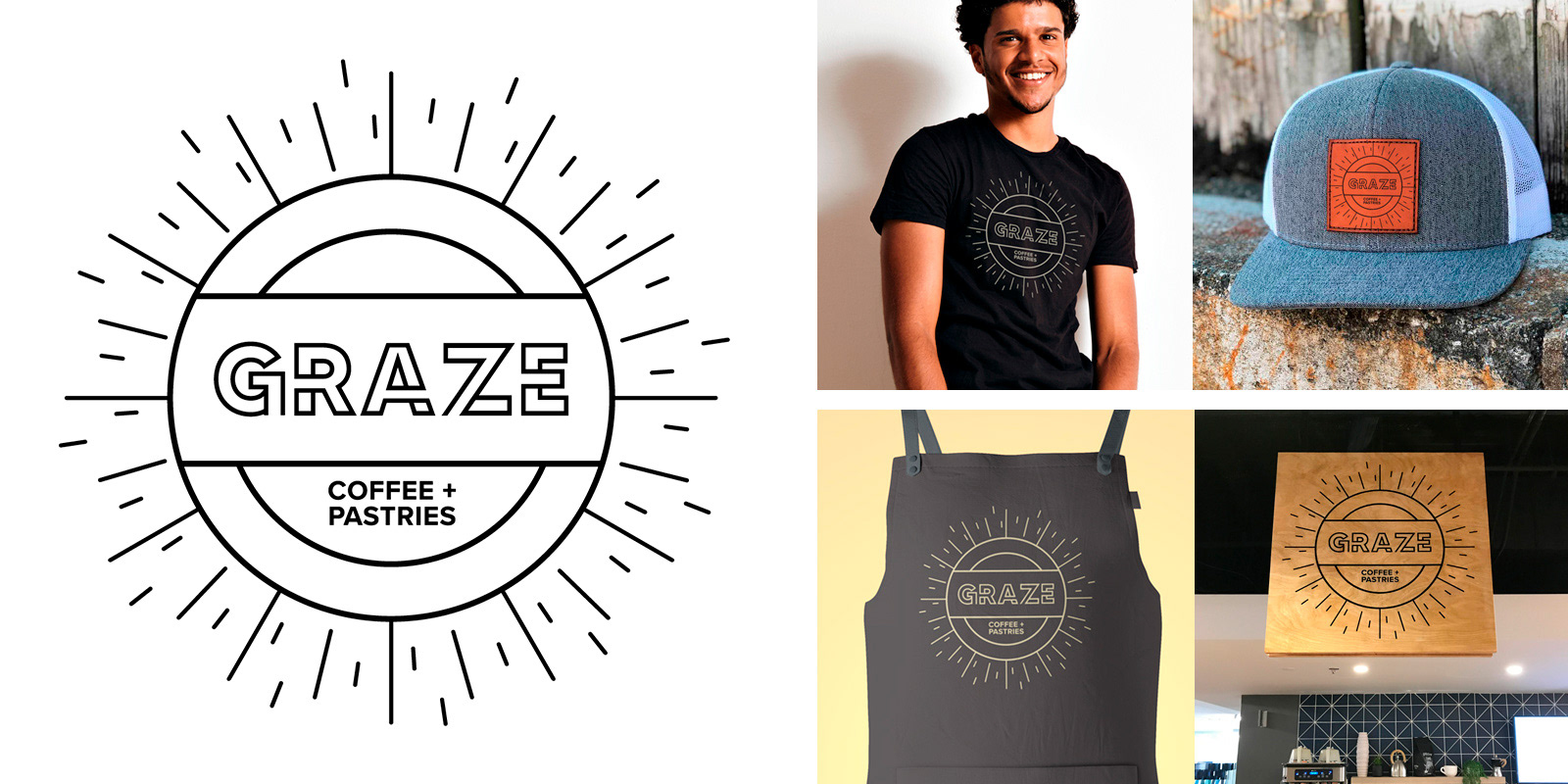
Logo design, merch/uniform application, in-store signage
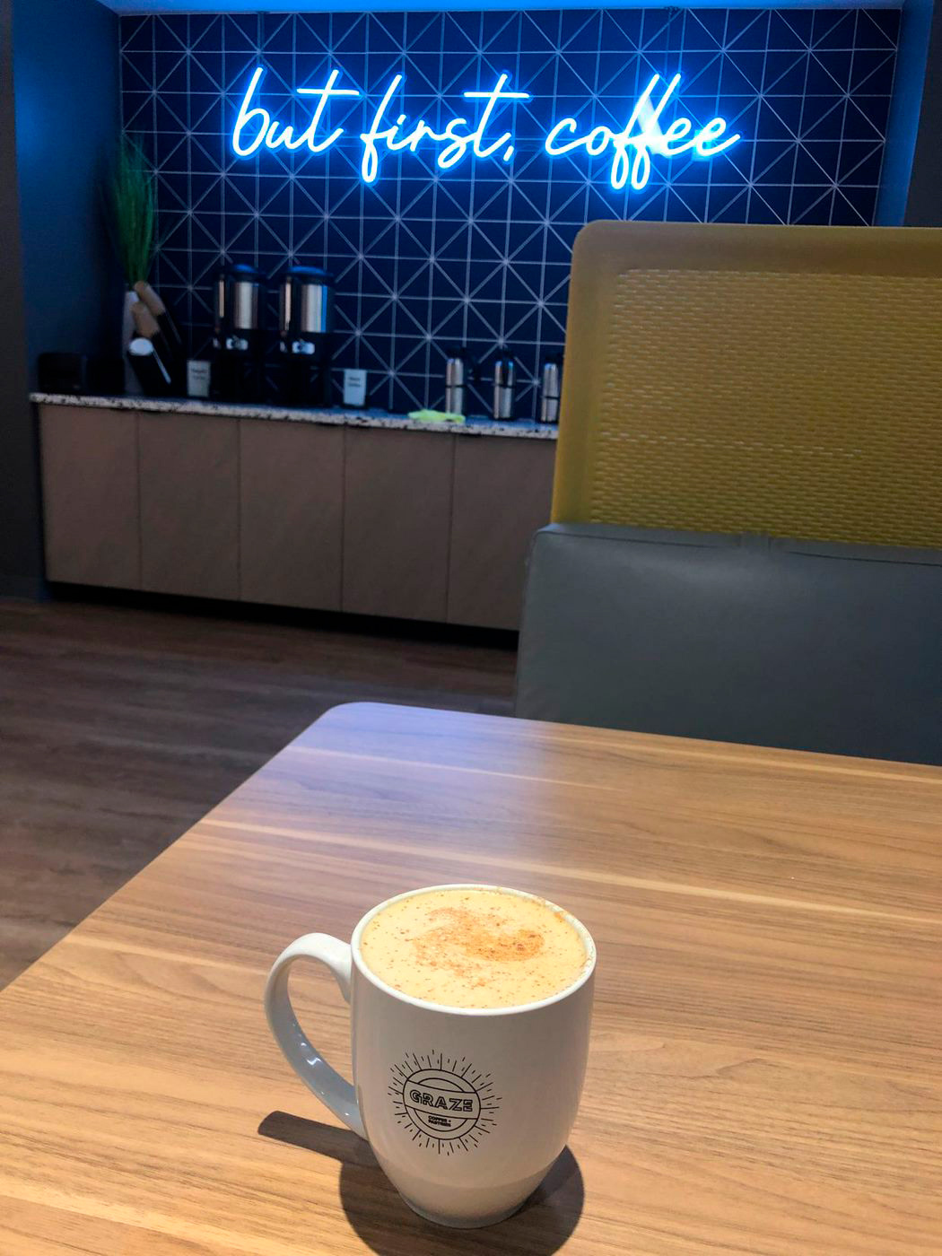
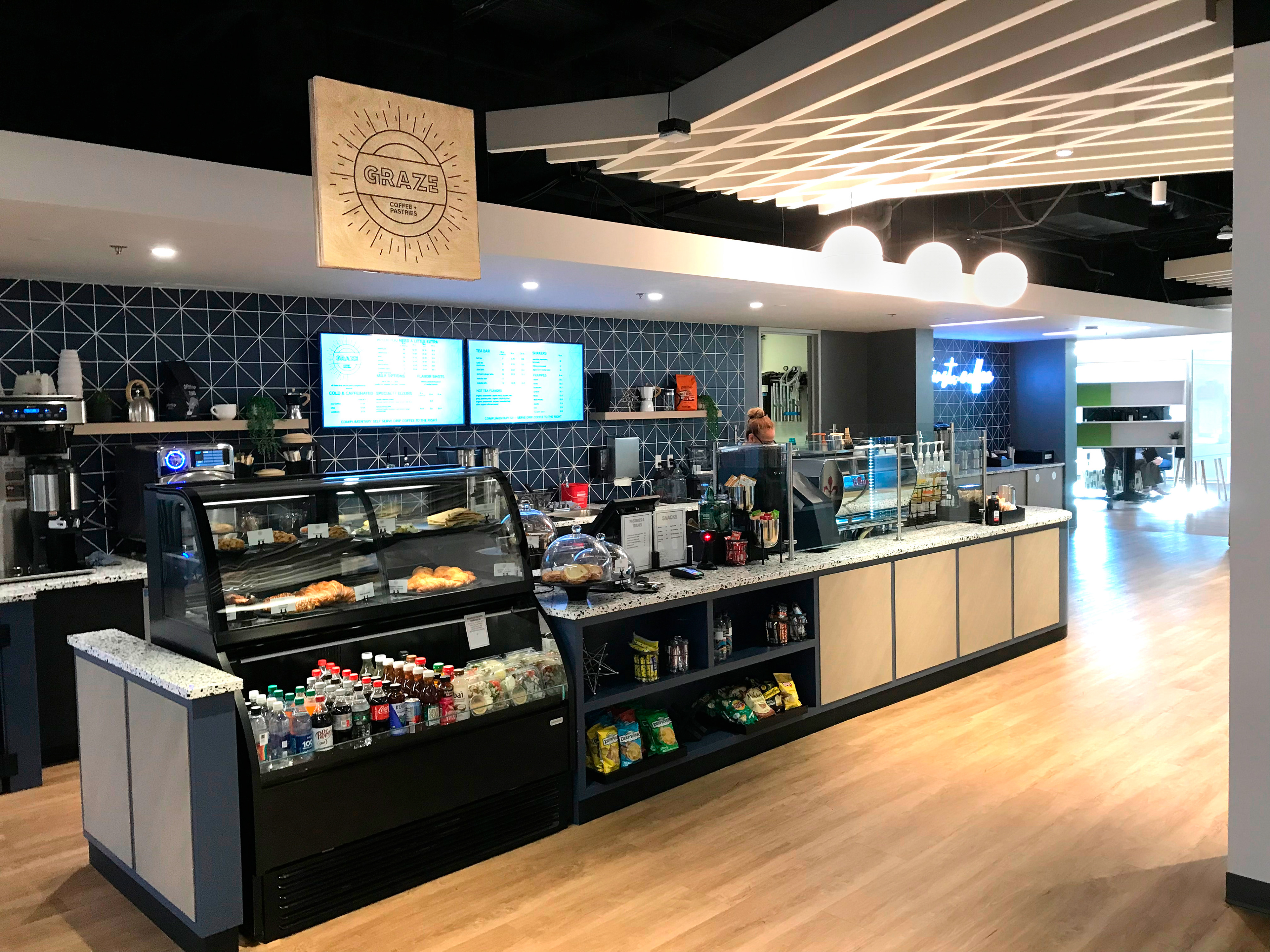
In the initial stages of RTO, Zebra renovated space in their Lincolnshire headquarters to add a fun new coffee and pastry café. The creative team was tasked with naming the space and designing the logo. GRAZE won out for its obvious tie-in to Zebra, as their employees are sometimes referred to internally as Zebras. For my logo option which was ultimately chosen, I kept it simple, one-color, and on-trend. Note that the shapes reference to the top-down view of a to-go coffee cup lid, and the not-so-subtle idea of a bright sunburst. I wanted to convey a feeling of joy to those who might not have been as excited to resume commuting back into the office. As I was designing my logo options, I took it a step further and provided merch/uniform and in-store signage executions, the latter of which was fabricated exactly as I envisioned it.