When I started at Evo Exhibits, the brand had a masculine, green, black and grey look and feel to their assets. Not a bad start, but there wasn't much substance beyond a color palette. A cohesive brand identity needed to be drawn out. I wanted to add an intentional, "designed" feeling to their identity. After all, Evo Exhibits differentiates themselves from their competition by a design driven company. Projects to tackle included a logo-rework, redesigned business cards, a new sales presentation template, complete website redesign, and employee SWAG. You know, just a few minor To-Dos to check off.
Logo Re-Work
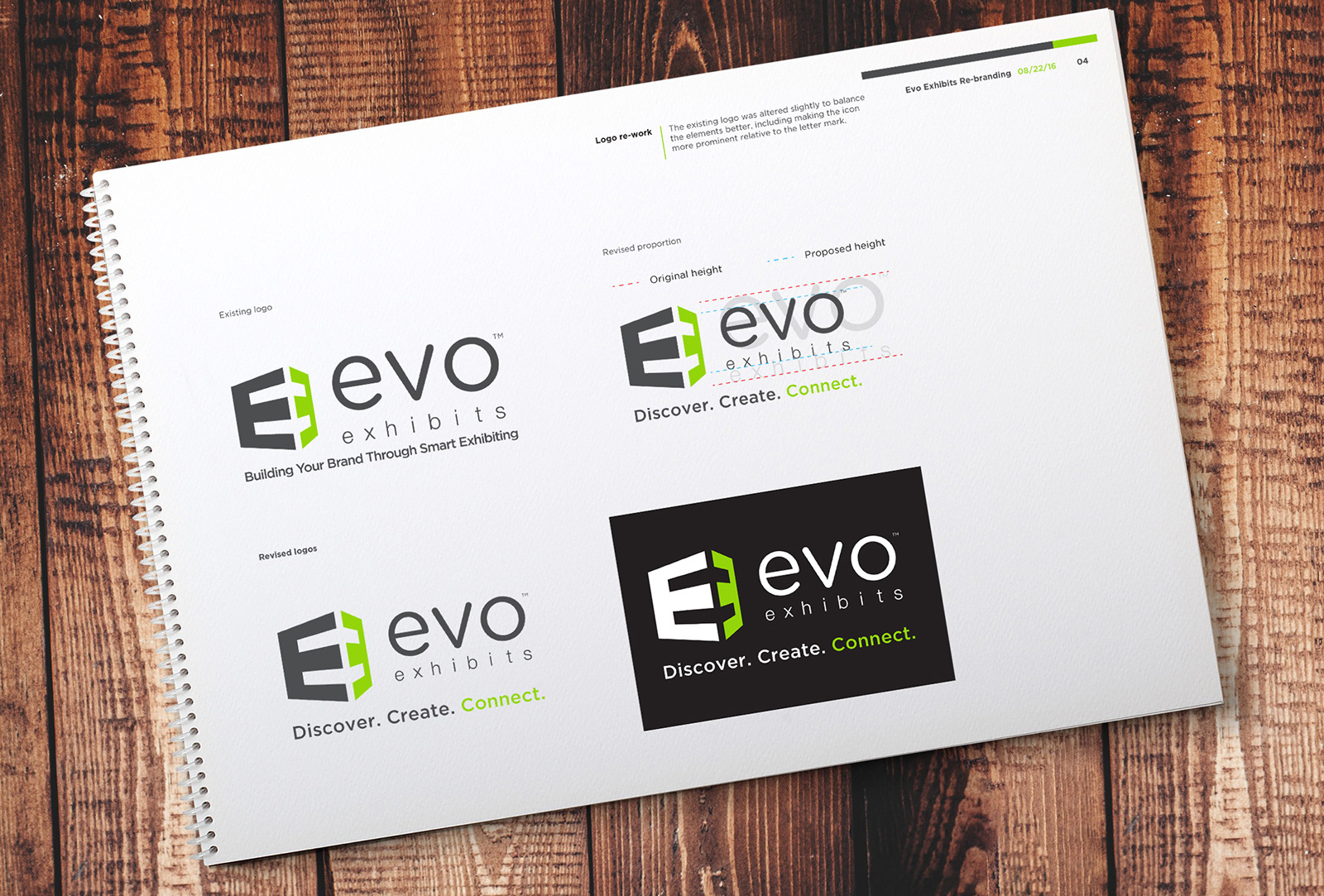
The existing logo was was slightly out of balance, and the company tagline had changed. But a complete redesign was not in the plans. As seen above, I refined the proportions of the icon to the "evo exhibits" text. Ultimately, the goal was to start using the double-E icon on its own in some situations, which leads us to the business card re-design below.
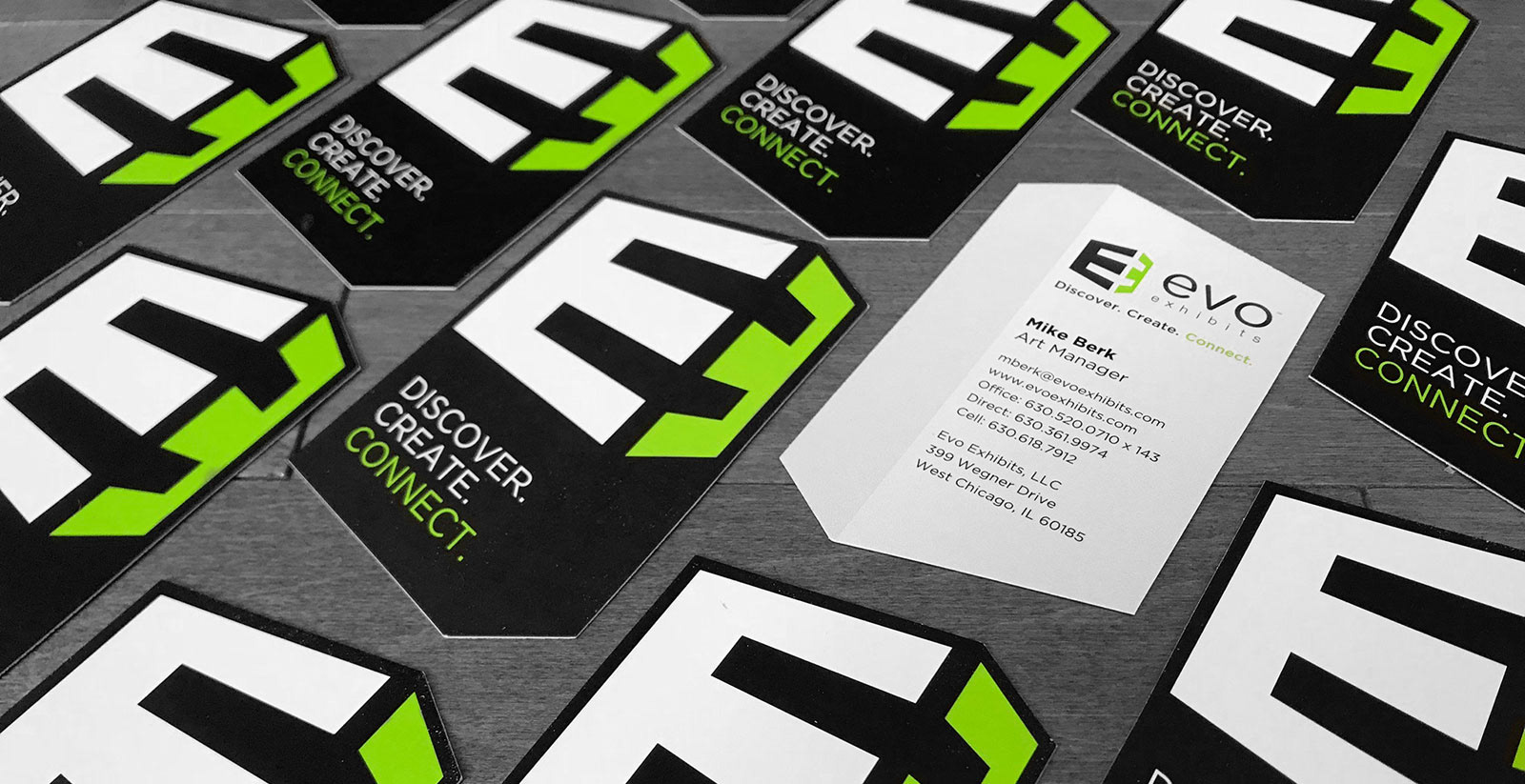
Business Cards
Trade show exhibits are inherently architectural. The double-E icon in the logo refers to that structure. With that in mind, I designed a unique, die-cut shape for the business card that was reflective of that angular construction.
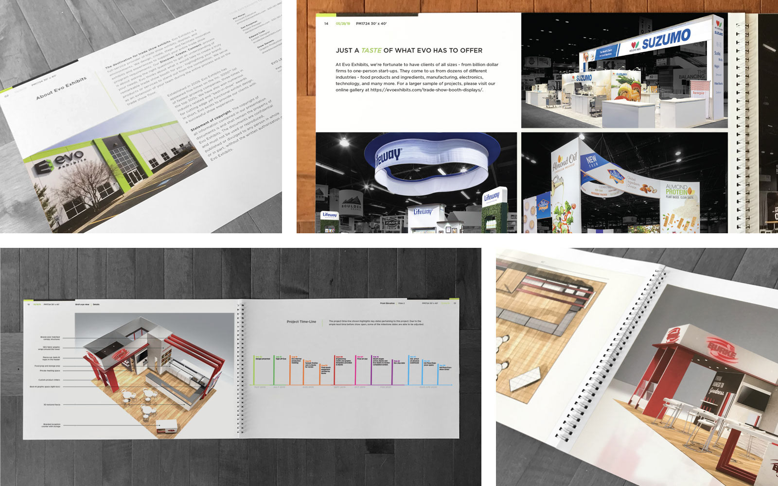
Sales Presentation
One of the most important communication pieces that represents Evo to a potential client is the sales presentation. The Creative Director, Dave Caswell, tasked me with creating an elegant, uncluttered, presentation format that would allow the exhibit designs to shine brighter than our competition. I designed it to be unobtrusive and on-brand, as well as simple enough that the exhibit designers could create new presentations themselves from the template. To that effect, I created libraries, wrote copy blocks, and provided all of the master pages they could ever need to customize the presentation for each potential client. Additionally, for larger dollar prospects, we included case studies in the book which I wrote and laid out.
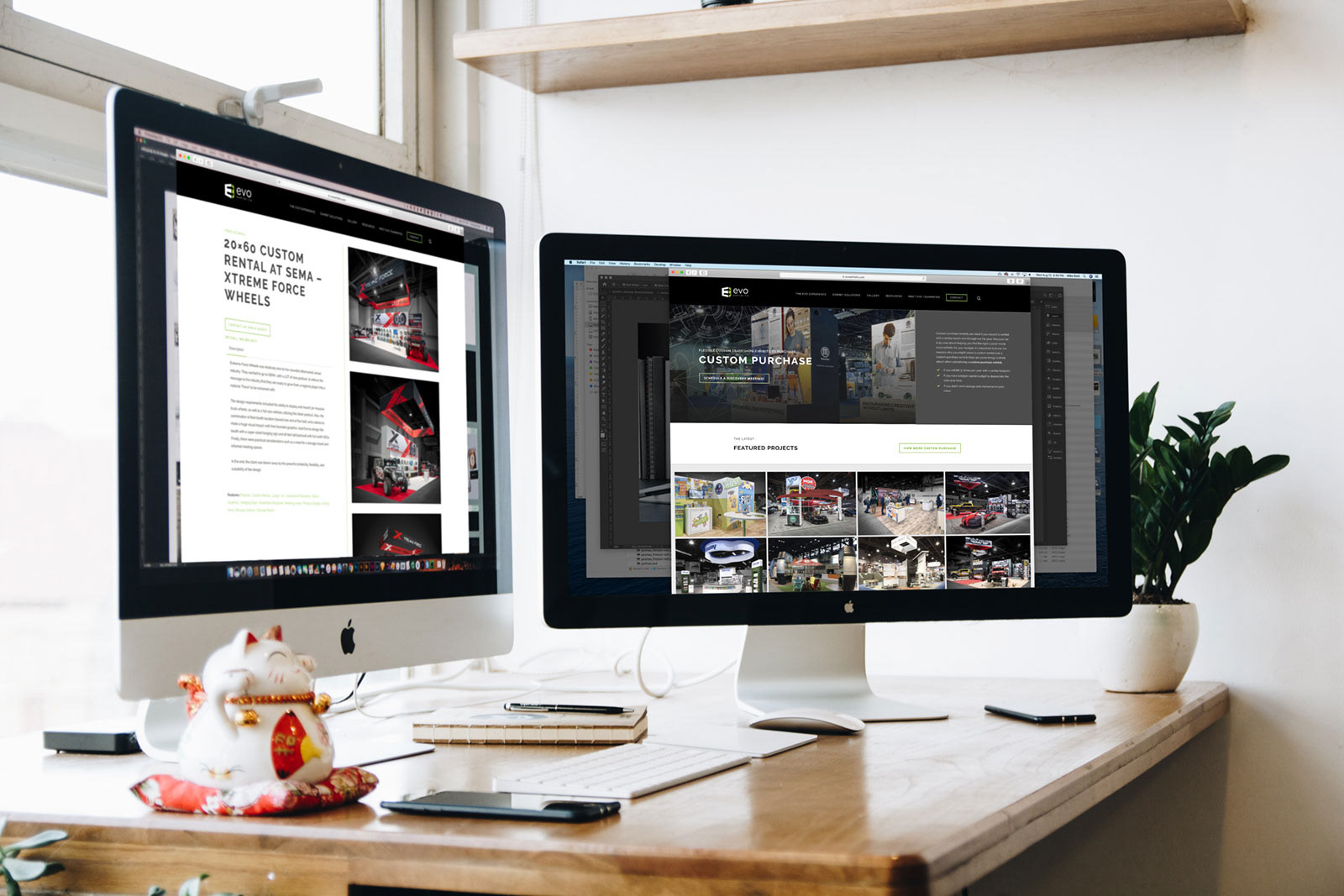
Website
Due to a legacy of selling commodity based display products, Evo's established website was built on an e-commerce platform. The transition to a semi-custom exhibit house, as well as a need to update the site to current web standards, dictated a start-from-scratch approach. Working closely with a talented marketing manager and great partners in the Cubicle Ninjas and Greenroom Productions, I lead the re-design of the site in a short, 3-month period from initial design to launch of the new Wordpress-based site. My roles included generating the creative brief, leading sitemap planning, providing design direction, collaborating on video production, digging in deep with the UX - particularly around the gallery functionality, and contributing with copy writing and editing. Site link
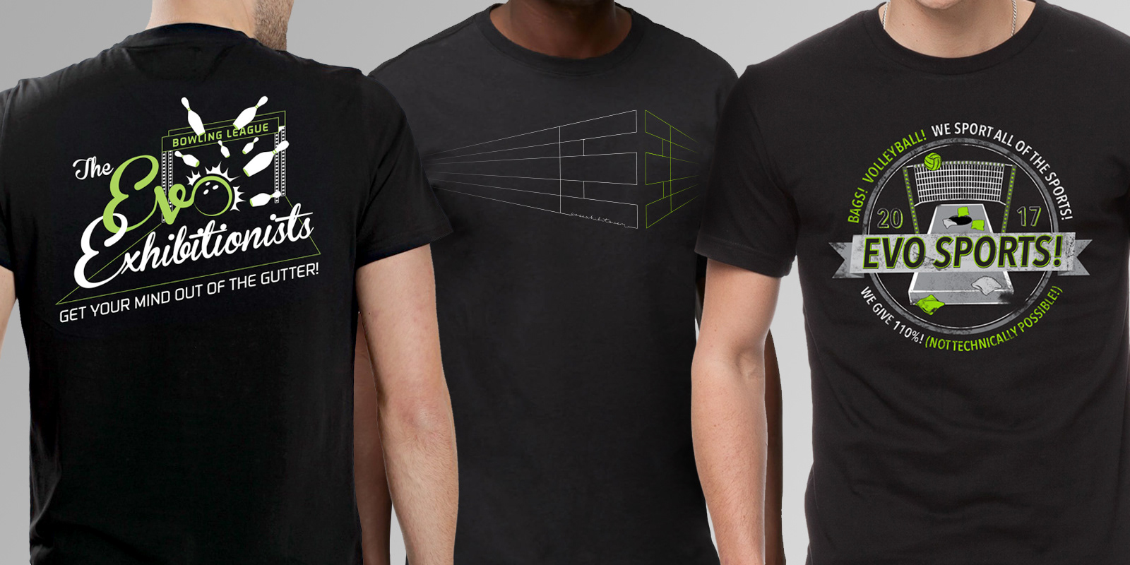
Employee SWAG
The old cliché about working hard and playing hard was true at Evo Exhibits. All of the designs reflected elements of the business, including the highly suspect double entendres. The left and right t-shirts were for team building activities: winter bowling and summer volleyball & bags leagues, respectively. The design in the middle was just to prove that we could keep it classy, if we absolutely had to.